To respect client confidentiality, we’ve omitted company names and detailed project information. The examples shown here highlight the types of services we offer and the level of design talent behind our work. They are only a small preview of what we create. If you’d like to discover the opportunities for your brand and walk through full project examples with full context, feel free to reserve a spot on our calendar.
Innovative App Design Case Studies
User Research Methods
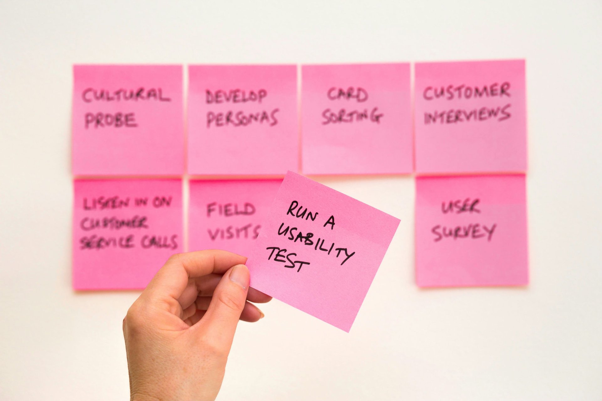
To gain a deep understanding of user needs and pain points, we employed various research methods:
User Interviews: Conducted in-depth interviews with 25 app users to gather insights into their motivations, preferences, and frustrations.
Surveys: Distributed online surveys to over 300 users, collecting quantitative data on app usage patterns, feature preferences, and satisfaction levels.
User Persona Development: Created a detailed persona, representing the needs and behaviors of a typical user – a busy working mother seeking convenience and efficiency in online grocery shopping.
User Journey Mapping: Mapped out the end-to-end journey of grocery shopping through the app, identifying key touchpoints and areas for improvement.
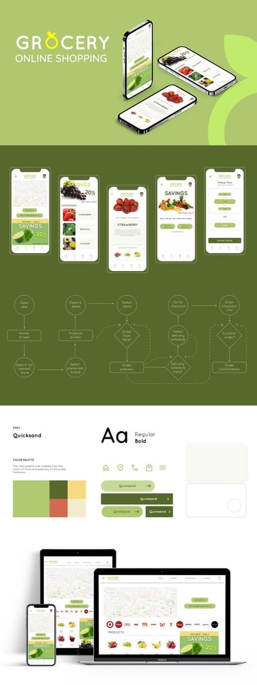
Project Overview
This project aimed to revamp the user experience of an online grocery store app by addressing two critical pain points: scheduling pickups/deliveries and tracking orders. Customers expressed frustration with the current scheduling process and the lack of real-time order tracking, hindering their overall shopping experience.
Elevating the Online Grocery Experience:
A User-Centric Redesign
The Challenge
User Research and Insights
Through extensive user research, we identified the following key issues:
Scheduling Woes:
Customers found the existing scheduling process for pickups and deliveries cumbersome and confusing, leading to uncertainty and inconvenience.
Lack of Order Visibility:
The absence of real-time order tracking left customers in the dark, causing anxiety and dissatisfaction.
Inefficient Search and Comparison:
Users struggled to find relevant products quickly, lacking suggested search queries and side-by-side product comparison capabilities.
Inability to Save Searches:
The inability to bookmark or save search results made it difficult for users to review and compare products later.These pain points highlighted the need for a user-friendly scheduling system, real-time order tracking, and enhanced search and comparison features to create a seamless and convenient online grocery shopping experience.
The Design Process
Armed with valuable user insights, our team embarked on an iterative design process:
1. Ideation and Wireframing
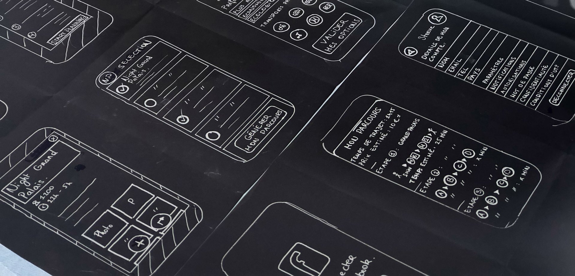
Explored multiple design concepts through hand-drawn sketches and low-fidelity wireframes, focusing on improving scheduling, order tracking, search, and product comparison features. This phase involved:
Collaborative ideation sessions with cross-functional teams
Rapid prototyping and iteration based on user feedback
Benchmarking against industry best practices and competitor analysis
2. Prototyping and User Testing
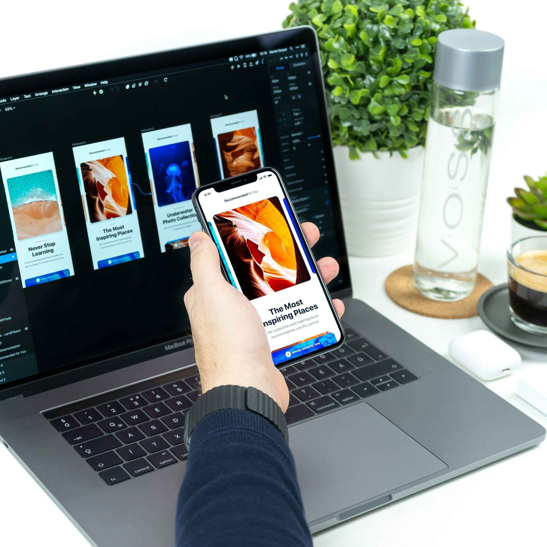
Developed interactive prototypes and conducted usability testing sessions with 20 participants, gathering feedback on the proposed designs. This phase involved:
Moderated usability testing sessions with think-aloud protocols
Remote user testing with participants from diverse demographics
Iterative refinement based on user feedback and insights
3. Visual Design and Branding
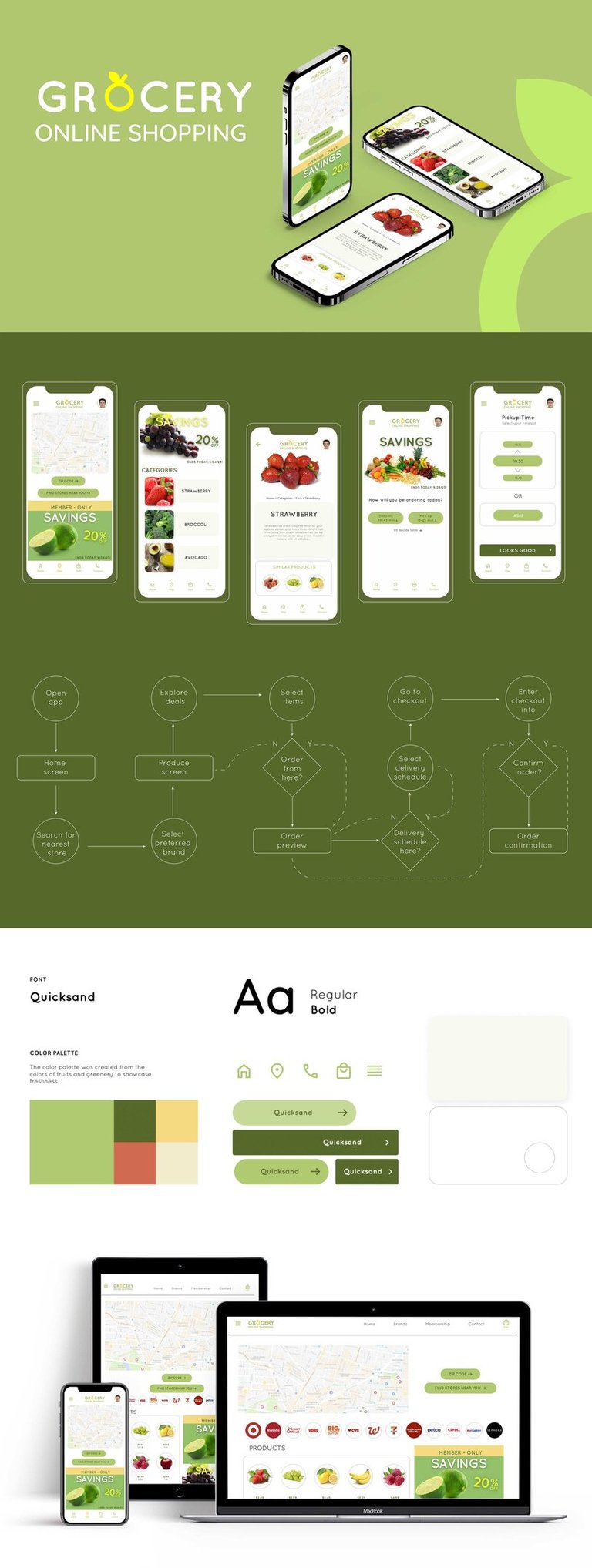
Crafted a refreshed visual language, including an updated color palette, typography, iconography, and illustrations, aligning with the brand's identity. This phase involved:
Establishing a cohesive design system and style guide
Ensuring accessibility and inclusive design principles
Collaborating with brand and marketing teams for consistency
4. High-Fidelity Mockups and User Flows
Created detailed mockups for all screens, incorporating user feedback and refining the overall look and feel across mobile, tablet, and desktop devices. This phase involved:
Designing intuitive user flows and interactions
Conducting expert design reviews and heuristic evaluations
Ensuring consistency and adherence to platform-specific design guidelines
The Solution
The redesigned online grocery app featured several key improvements:
Streamlined Scheduling
Introduced a user-friendly scheduling system with a calendar view, allowing customers to easily select preferred pickup or delivery times. This feature included:
Intuitive date and time selection
Real-time availability updates
Integration with personal calendars for seamless scheduling
Real-Time Order Tracking
Implemented a real-time order tracking feature, providing customers with up-to-date information on their order status and estimated delivery times. This feature included:
Live order status updates
Estimated delivery time calculations based on real-time data
Push notifications for critical order updates
Intelligent Search and Suggestions
Incorporated an intelligent search functionality that displays suggested or popular search queries based on user input, streamlining the product discovery process. This feature included:
Autocomplete suggestions based on user input
Popular search queries based on real-time data
Personalized suggestions based on user preferences and purchase history
Side-by-Side Product Comparison
Enabled users to compare products side by side, empowering them to make informed decisions based on factors such as price, quality, and other relevant attributes. This feature included:
Customizable comparison criteria
Detailed product information and specifications
Ability to add or remove products from the comparison view
Bookmarking and Saved Searches
Introduced the ability to bookmark or save search results, allowing users to review and compare products at their convenience. This feature included:
Easy bookmarking and organization of saved searches
Personalized recommendations based on saved searches
Seamless integration with user accounts for cross-device access
Results and Impact
The redesigned online grocery app was met with overwhelmingly positive feedback from users and stakeholders alike:
28% increase in app downloads and active users
32% boost in order conversion rates
25% reduction in customer support inquiries related to scheduling and tracking issues
4.8/5 average app rating, with users praising the intuitive design, scheduling convenience, and real-time order tracking
Through a user-centered design approach, extensive research, and iterative refinement, we successfully elevated the online grocery shopping experience, delivering a seamless and convenient solution that addressed customers' pain points while driving measurable business impact for the client.

